
 Interior Paints
 Exterior Paints
 Primers
 Stains & Clears
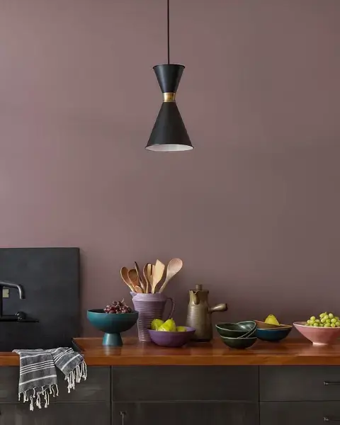
 Paint Brushes
 Paint Roller
 Paint Trays & Liners
Orange is not just a Halloween color; it also can be an integral part of a year-round decorating scheme.
By Diane Franklin
Orange is the color of scary jack-o’-lanterns, but you don’t have to fear it in your decorating. If you’ve previously shied away from orange because of concerns that it would be too garish, rest assured that orange is a versatile color choice that can set many different moods—from dramatic to whimsical, from sophisticated to energetic. Below are just a few ideas for incorporating the color into your home’s interiors.
Orange as a Wall Color
Orange as a wall color may seem overpowering, but if used in shades that are appropriate for the space, it can be a truly wonderful choice. Warm colors such as mandarin, marigold, persimmon, spice, salmon, sienna, copper or sunset can be dramatic yet comforting in a variety of interior spaces, including living rooms, dining rooms, great rooms, bedrooms, foyers, kids’ rooms, rec rooms, man caves and “she sheds.” If you like orange but are unsure if you want it on all four walls, a more measured approach would be to use orange in limited doses, such as on a feature wall or above a chair rail.
Just as important as the use of orange as a wall color are the complementary colors used with it. For instance, pure white can be used in contrast with orange on baseboards, molding or wainscoting. Additional colors that go well with orange are its complement, blue, as well as yellows, golds and a full range of greens from citrus to forest. Oranges also go well with such neutrals as beiges, grays and taupes. If using orange as your prominent color, any of these colors mentioned can be used to contrast or complement the hue in accents, flooring choices, window covering choices and furnishings.
Orange likewise works well as a feature color in a wallpaper pattern. If you don’t want to go with orange as the predominant color in your wallpaper selection, you may wish to look for orange as part of a multi-color pattern or as a co-equal hue in a stripe. Orange is perfectly “at home” in a variety of wallpaper styles, ranging from traditional floral patterns to modern geometrics.
Orange as a Flooring Color
Orange not only works well on the wall—it also works well underfoot. Hardwood floors and laminate flooring that mimic hardwood often have an orangish hue. Think of such woods as oak, cherry or mahogany. Other types of flooring, such as ceramic or vinyl tiles, may have a hint of orange as well. Some emulate brick, terra cotta, clay or other earthy natural elements where orange is a predominant tone.
Another great use of orange is as a prominent color in area rugs. Area rugs are meant to be an eye-catcher, contrasting with the typically neutral color of the room’s hardwood flooring. Orange can be the main color in the area rug or it can be one of many vibrant colors that serve as an accent in the room.
Orange as Accents
Orange lends itself well to the use of accents and accessories in a room’s decorating scheme. It is a great choice to vitalize a room’s décor in such items as accent pillows, draperies, curtains, pottery, vases, lamps, artwork and more.
Keep in mind that these oranges don’t have to be monochromatic by any means. For instance, you could have a deep terra cotta lamp base, but the lamp shade could be a light, almost iridescent orange.
Materials likewise can vary—from the nubby textured burnt orange of a throw blanket to the translucent delicate look of a handblown glass vase to the orange mosaic tile of a kitchen backsplash.
With orange, the possibilities for your home décor are endless. So as you pull out the pumpkins, fall wreaths and spice candles to decorate this fall, remember: You can use the energy and drama of orange to enliven your home surroundings every day of the year.