
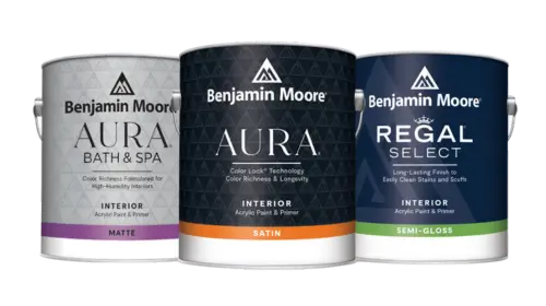
 Interior Paints
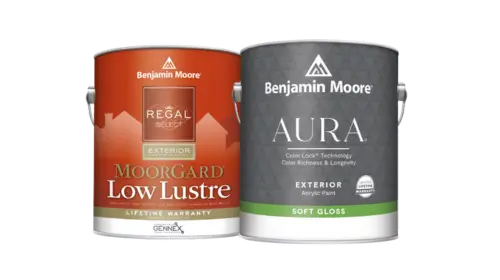 Exterior Paints
 Primers
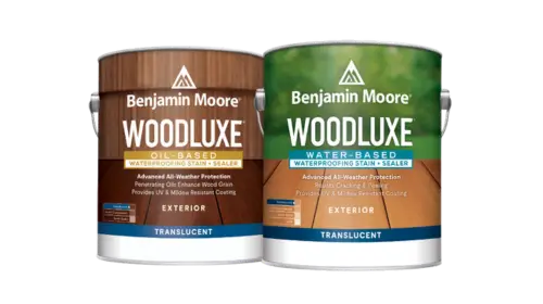 Stains & Clears
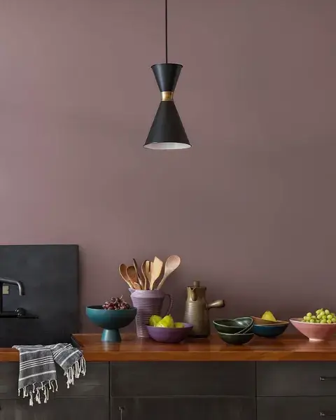
 Paint Brushes
 Paint Roller
 Paint Trays & Liners
Gray is one of the trickiest colors to use in decorating. Here are ideas to make it work.
By Diane Franklin
If you keep an eye on color trends, you undoubtedly know that gray has been one of the most popular hues in home decorating for the past four or five years. As a neutral, it works well in large spaces, such as great rooms, living rooms, dining rooms, home offices and bedrooms. However, its chameleon-like quality of changing appearance under different lighting or contextual conditions can make gray a difficult color to nail down.
Fortunately, if you understand the properties of gray, you can use the color successfully to add elegance and cohesion to your decorating scheme.
Finding Your Gray
In the paint world, there are literally hundreds of colors that can be classified as gray. It can be a whisper of color, just a touch beyond off-white, that can serve as a nice neutral for a suburban home with an open floor plan. Or it can be a steely, industrial-like hue that proves the perfect backdrop for a downtown loft apartment. Another option is charcoal gray, which looks gorgeous in a home office or as a contrasting color to white wainscoting in a formal dining room. Gray works with every style and evokes every mood, from understated elegance to contemporary chic.
Arriving at the perfect gray for your home setting can be a challenge. The gray you choose may look perfect on the color card at the paint store, but it could look very different once you take it home and view it under different lighting conditions surrounded by the existing colors in your home. It may look purple, it may look blue—possibly even green, beige, tan or white.
Purchasing sample-size containers as a way of “previewing” the color can help—but be careful. Many consumers make the mistake of painting a sample of gray directly onto their walls, not realizing how the existing color will influence the look. For instance, if your existing wall color is yellow, the gray sample may appear blue.
Instead of painting your choice of gray directly on your wall, paint a sample board instead. This will give you a truer rendition of the color—plus a sample board is portable, so you can move it around from wall to wall or even room to room. Make sure you view the color in various lighting conditions—from natural lighting to the overhead lighting or lamp lighting you use in the room.
If you’re still uncertain about your color choice, turn to the expert advice available at your local paint store. Many stores have in-store color experts who can help you make your choice—or they can go into your home to do a color consultation to help you pick the best possible gray to go with your décor.
How to Use Gray
Gray works well in virtually any room of your home, but it is especially effective as a backdrop for public areas, such as foyers, great rooms, living rooms and dining rooms. The color can even work well in children’s room and nurseries as a backdrop for other more playful colors in the furnishings and accessories.
Many grays have an undertone such as blue, purple or green, so keep that in mind when selecting your coordinating colors. For instance, if your gray has a hint of purple, you may not want to pair it with yellow as this may bring out the purple undertones more forcefully than you intend. Instead, you may want to go with blue or purple accents in your fabrics and accessories so that the gray on your walls appears more neutral. Cream-colored or tan furnishings also will keep the purple undertones in the gray from seeming more purple than you intend.
With gray as your neutral, you can ensure that other color choices for furniture, floorcovering, window coverings and accessories will work well without clashing. Because gray is a great background color, it frees you up to use vibrant colors in your accent pieces. For instance, a black foyer table will contrast well with the gray on your walls. In a living room or great room, go for “pops” of color with throw pillows, area rugs, wall art, draperies and accessories. Pick a particular color—such as cobalt blue—to repeat in several pieces to give your room a more cohesive and coordinated look.
Colors That Work Well with Gray
Since gray is such a versatile neutral, virtually every color goes well with the hue. Here are just a few ideas to consider as you work with the color:
- White baseboards and molding. White works great with gray, but particularly with a charcoal gray, white baseboards, molding or wainscoting will really pop!
- Black accent pieces. Consider black picture frames, accent tables and accessories as a way to contrast with light to mid-gray tones.
- Bright colors. While the entire color palette is at your disposal for coordinating with gray, some hues have a heightened level of sophistication when paired with this neutral. Just a few choices that will work well with gray include seafoam green, cobalt blue, orange and coral red.
- Dark wood. Dark hardwood floors and furniture in tones such as mahogany or walnut provide a rich ambiance and elegance that complement gray walls beautifully.
Other neutrals. You don’t have to settle on gray as the only neutral in your room’s décor. Consider other neutral colors, such as a brown leather chair or taupe throw, to add some character and interest to the room.