 Interior Paints
 Exterior Paints
 Primers
 Stains & Clears
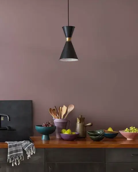
 Paint Brushes
 Paint Roller
 Paint Trays & Liners
Colors that have come and gone are being reinvented for renewed homeowner appeal.
By Diane Franklin
Once upon a time, avocado green, harvest gold and dusty rose were the most popular hues in the land—and then they disappeared, banished to the Kingdom of Outdated Color Trends. Would they ever be seen again? The answer is yes! These colors and other outdated hues have been freshened up for a surprising comeback in home décor.
Kitchen Colors Reinvented
In the 1970s, it seemed like almost every house had an avocado green or harvest gold refrigerator. To coordinate with these appliances, these colors also found their way onto kitchen walls as paint or wallpaper. Eventually avocado green/harvest gold fatigue set in, and these colors virtually disappeared from the home décor palette for the next several decades. Lo and behold, here they are again with color experts proclaiming the avocado green/harvest gold duo as one of the biggest comeback stories of the millennium.
No, you’re not going to see them on your fridge anytime soon—neutral colors like black, gray, slate and stainless steel have a monopoly on that—but soft, sophisticated greens are making a comeback on walls, cabinetry and accent pieces, while harvest gold is making a subtler reappearance in accessories, wallpaper and chair upholstery. Small doses of these colors means less likelihood that the American public will grow tired of them again.
Dusty Rose/Mauve Revisited
Mauve was all the rage in the 1980s and then segued into the dusty rose of the 1990s. But like the kitchen appliance hues of the 1970s, these home décor colors shone too brightly not to burn out. Eventually, they faded away like photographs left in the sun too long.
The last few years have brought a dusty rose/mauve revival, thanks in part to the explosion of gray on the home décor scene. Gray and other neutrals pair so beautifully with these colors that it was virtually inevitable that they would reappear. It was subtle at first—a mauve accent pillow on a gray couch, a dusty rose floral treatment on a gray-based wallpaper—but now we’ve started seeing mauves and dusty roses again as the overall theme for powder rooms, feature walls and romantic-themed bedrooms. Palettes for 2019 and beyond will undoubtedly have a prominent spot for both of these two hues.
Beige Rides Gray’s Coattails
Gray has been so dominant in home fashion lately that it’s essentially crowded out many of the other neutrals. Beige had been on the outs for a while, initially making way for trendy neutrals like taupes, browns and subdued greens before being slapped with the “too boring” label. But beige has found an opening when mixed with gray—the so-called “greige” that seemingly went out of fashion in the early 2000s. Beige is just one step away from greige and seems a logical progression when people start feeling “gray overload,” so expect to see more beige in hallways, guest bedrooms, living rooms and other areas where a neutral backdrop is desired.
Jewel Tones Shine Once More
Emerald green, ruby red, sapphire blue, amethyst purple—those colors sparkled in the 1990s. With the economy going well, consumers were happy to show their opulence. But as is the case with many bright and shiny objects, interest was fleeting. These colors are re-emerging, however, but being used in a more understated, less gaudy manner to connote sophistication, elegance and good taste. Chances are you’ll see them being used in formal dining rooms and living rooms, perhaps as a feature wall, oftentimes being used deeper, darker and more saturated to provide less flash, but more drama.
Seemingly, consumers have learned a lesson from the colors of the past. Color shouldn’t be overused or misused. A little bit of a vibrant hue goes a long way, and it’s always possible to reinvent colors that have grown tiresome so that they are welcome in our homes once more.