
 Interior Paints
 Exterior Paints
 Primers
 Stains & Clears
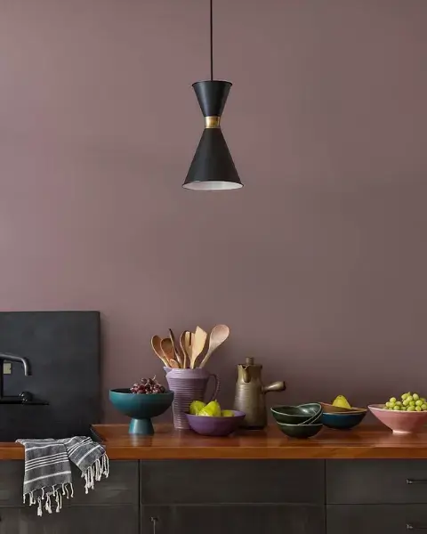
 Paint Brushes
 Paint Roller
 Paint Trays & Liners
Don’t be shy! If you like bold colors, there are ways to pull them off beautifully.
By Diane Franklin
Hot pink in the bedroom, lime green in the dining room, orange in the kitchen—do these colors really work? Yes, they can! If you want to try some bold colors but aren’t sure how to pull them off, here are some suggestions for making them work beautifully for you.
Small Doses, Big Impact
If you love bold colors but are reticent about going too big, try the colors in small doses. One great way to do that is by using a bold color on a feature wall. Or choose a wallpaper that features the color prominently but not exclusively. Also, break up the use of the color with another prominent feature in the room. For instance, use a vibrant pink behind the headboard in a bedroom or try an emerald green adjacent to the fireplace in the family room.
Provide a Contrast
A bold color on the wall can be contrasted nicely with clean, white moldings, neutral furnishings and neutral floor coverings. You can pick up the bold wall color in smaller accessories such as throw pillows or as accent colors in drapery or upholstery fabric. And sometimes a contrasting hue on the color wheel—such as navy blue paired with a lime green—can provide just the right balance to pull your bold color choices off with panache.
Go Monochromatic
As an alternative to a room with contrast, you can take the opposite tack and go monochromatic. If you want a bold blue, set the stage for it by using lighter blues in your furnishings and accents. The result can be an extremely cohesive look that is easier on the eyes than just using a bold blue on its own. However, do provide some relief from the color with natural woods and patterns that introduce some white or other soft neutral colors into the scheme.
Be Bold, Not Garish
When using bold colors, be daring and sophisticated—not cartoonish or garish. Choose bold colors that are deeper, darker and muted; the colors can still be dramatic without being off-putting or over-the-top. Some examples include jewel tones like amethyst and topaz or classic colors like navy blue or forest green.
Go Bold With Furnishings
An alternative to using bold colors on the walls is to be bold with furnishings instead. Paint a foyer table in a vivid lime green. Use lemon yellow upholstery for a couple of accent chairs. Or consider using an area rug in a bold geometric pattern that adds personality and pizzazz to the room. Pick up your featured furnishing colors in small doses elsewhere in the room—i.e., on throw pillows, in accessories, or as accent colors in your wallpaper. Paint colors used here would be soft neutrals, such as gray or off-whites, which really will allow the furnishings and accent pieces to take center stage.
Take a Powder
Sometimes it’s best to use bold color in a smaller room like a powder room or spare bedroom. You can get experimental, trying colors that you might not use in other areas of your home. A powder room can be an especially apt place for bold color. But make sure the color is light enough and bright enough so that it doesn’t make the room seem small or claustrophobic.