
 Interior Paints
 Exterior Paints
 Primers
 Stains & Clears
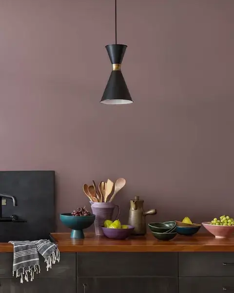
 Paint Brushes
 Paint Roller
 Paint Trays & Liners
Blue, a primary color, suggests truth, constancy, sincerity, and tranquility. Blue is universal due to his familiar associations with oceans and the sky. Blue’s calming quality make it great and often primary choices for bathrooms and bedrooms. Commonly, monochromatic schemes are used with variations of blue in shades, tints and tones combined together. The range of blue varies from warm-green hues to cool-purple. Blue, especially when used in children’s room’s, can be simply altered with different accents as they become older. Accents such as off whites and yellows can give a warm feeling and the impression of a beach. Whether you use it in a more formal setting(Navy) or more playfully (Turquoise), Blue can be perfect in almost any space.

Blue comes in a variety of hues that can work for any space. Benjamin Moore’s eclectic range from of hues, such as Peacock Blue() for example, are bound to make an impression. This color adds a vibrant pop of teal blue that can give a kitchen a playful, modern sensibility. Accented with a cool green such as Acadia Green and White Dove, this color combination will create a tropical and refreshing feeling to your space.
Darker blue’s such as Benjamin Moore’s New York State of Mind(805) tend to accent other colors in a space while not becoming overwhelming. Dark blue can anchor an elegant dining room and while deep blue’s can have a tendency to recede in space. Accents such as Benjamin Moore’s Kurkuma (AF-350) and Calm(2111-70) can offset the deep blue for a harmonious color scheme.
On the other hand is Benjamin Moore’s collection of softer hue’s such as Blue Stream (1668)and Buckland Blue (HC-151). Combining two different types of soft, light blue’s can create a sense of serenity and peacefulness. These blue’s are used more commonly in bathroom and kitchen settings as well as spaces for children, primarily boys.