 Interior Paints
 Exterior Paints
 Primers
 Stains & Clears
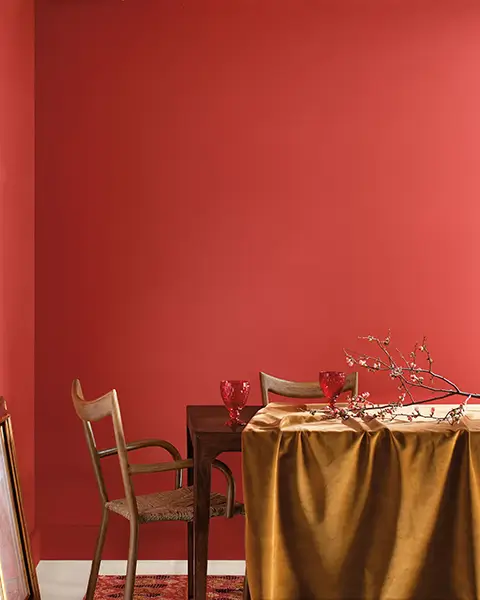
 Paint Brushes
 Paint Roller
 Paint Trays & Liners
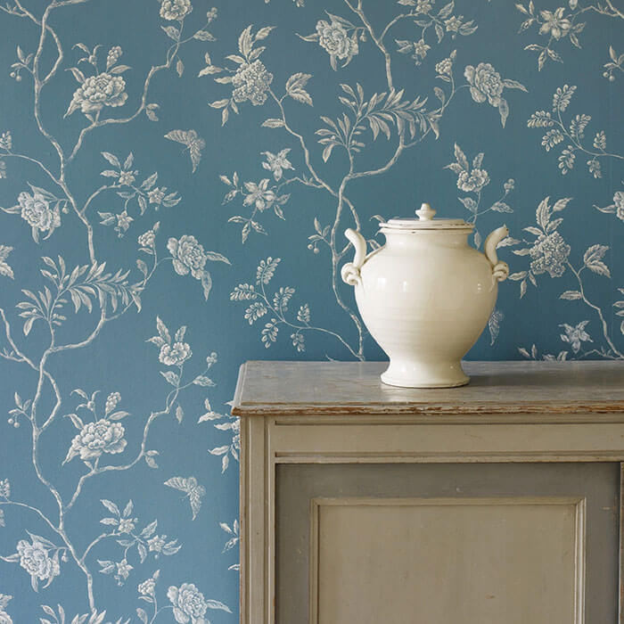 Wallpaper
 Design Services
 Designer Fabrics
Color experts are starting to reveal what we can expect in the 2020 home fashion palette.
By Tammy Adamson-McMullen
As color experts predicted, the home fashion palette this year is full of natural, complex and peaceful colors. A deep teal currently holds the No. 1 spot in the palette, followed in no particular order by hazelnut, mushroom, grayed lilac, mustard, icy blue, blackened green, light pink and coral.
Several leading color experts already have announced their picks for next year’s top colors. What we know, based on these announcements, is that 2020 also will be a very colorful year, with many of the same color families at the front of the pack.
However, individual hues within these families are taking on some rather unusual characteristics, creating colors with a “twist.” What is bringing about this color change? Color experts point to our increased concern over the environment, the march of technological innovation and our collective vision of the future.
Here are some of their predictions for 2020.
Blues Reign Supreme
Many color experts once again are putting complex blues at the top of the palette. But these don’t look anything like the deep teal that was popular this year.
An example is PPG paint brand’s recently announced 2020 Color of the Year. Called Chinese Porcelain, the color is a beautiful blend of cobalt and inky blue. Reminiscent of ancient Chinese pottery, the color pairs well with whites and with metallics like copper.
According to PGG, Chinese Porcelain is calming and meant to offer a respite from our busy lives. “The need for simplicity and escapism from technology is, in part, the reason that consumers are craving blues like Chinese Porcelain …” says Dee Schlotter, senior color manager, PPG paint brand, noting that the color creates serenity in any space.
The Pantone Color Institute hasn’t officially named its 2020 Color of the Year, but many industry watchers surmise that it will be an oceanic blue. A Pantone representative earlier this year was reported as saying that the color will come from the sea; however, this isn’t much of a clue since Pantone’s top 2019 color, Living Coral, also claims that distinction.
Pantone’s oceanic blues include a complex color called “Baltic,” which is a lovely turquoise that leans more toward blue than green. Could this be the top color? Stay tuned …
Purple-Touched Pinks
Next year’s palette also will pay homage to pink, but the color will be a fusion of pink and purple. Called “Millennial Pink” or “Cassis,” the color is reminiscent of the dusty pink that was popular in the 1980s but with an ethereal and more sophisticated hand.
A global trend authority, WGSN, is among those putting Cassis at the top of the palette. WGSN specifically says to watch for “Cassis-type purples,” which suggests that the color may lean more toward purple rather than pink.
Like the soft pinks that are popular this year, Cassis will pair beautifully with hazelnut and other brown-based beiges. As more paint companies announce their 2020 palettes, look for at least some form of a complex pink to be at the top of the heap.
A New Green
Green is always an important color in the forecast palette. This year, the color was dark and velvety. In 2020, WGSN predicts that green will lighten all the way to mint. This isn’t the pastel color that was popular decades ago. Instead, this mint green will look somewhat digitalized, or “neo-minty.” What’s interesting is that the emergence of Neo Mint isn’t a backlash to technology but rather an embrace of it. But at the same time, the color also is reminiscent of the natural world.
“Neo Mint is an oxygenating, fresh tone that harmonizes science and technology with nature,” explains WGSN on its “Insider” blog. “It has a cool, futuristic tech feel but also connects with plant life and nature.” WGSN says we will start seeing this color before the end of 2019.
Complex Yellows
Yellows have shown bright for a couple of years now. Benjamin Moore named Lemon Sorbet the top color in 2018. This yummy color has continued its popularity in 2019, along with a range of other mid-tone yellows, like mustard.
Color experts predict that yellow in 2020 will continue its ascent but take on an earthier quality. The top contender, according to the Color Marketing Group (CMG), will be a green-influenced gold called “Electrum.” CMG predicts that Electrum not only will rise to the top of the yellow color family but also to the top of the North American color palette. Its appeal lies in its ability to shift between green and gold, depending on the other colors in the decorating scheme.
Additionally, CMG believes Electrum will be popular because it speaks to our growing environmental awareness and rekindled love of gold metallics in the home. It’ll be interesting to see if the color overtakes blue in the coveted top spot of the 2020 palette.